18 Accessibility to the online reader
Accessibility in online content refers to the practice of organizing digital content so that it can be used by a wide range of people (including those with disabilities). Pressbook’s guide to Accessibility and Digital Design offers a broad overview of applicable design principles and best practices.
- Use chapters, headings, and subheadings to organize content.
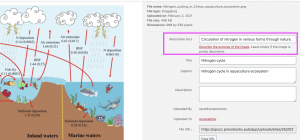
- Add alternative text to functional images that clearly describe the content. An example is given below:

To learn more about accessibility for images, check this link: Image concepts
- Use a color contrast tool to verify the readability of the text.
- Colour Contrast Analyser (for Windows or Mac)
- WebAIM Color Contrast Checker (online tool)
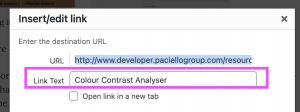
- Include descriptive text when using links to other web content. Do not use the words “click here” or “read more”.

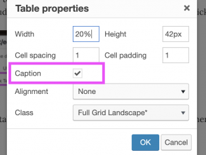
- When using tables, provide properly tagged table titles/captions and table headers/footers where appropriate. Avoid using merged or split cells wherever possible. For example, the caption for the table below is – “Events”

| Date | time | location |
| 02/02/2020 | 2:30 pm | SPSCC |
| 02/03/2020 | 2:30 pm | SPSCC |
- Include captions and/or transcripts for any multimedia you include with your text.
Site Map
The site map offers users an alternative means of navigating your Pressbook.

Source: https://guide.pressbooks.com/chapter/accessibility-universal-design/
![]()
Pressbooks User Guide
Reference

