
19 3 Advanced – Advanced Formulas, Functions and Macros
Pivot tables and macros
Outcomes:
Analyze worksheet data using a trendline
•Create a PivotTable report
•Format a PivotTable report
•Apply filters to a PivotTable report
•Create a PivotChart report
•Format a PivotChart report
•Apply filters to a PivotChart report
•Analyze worksheet data using PivotTable and PivotChart reports
•Create calculated fields
•Create slicers to filter PivotTable and PivotChart reports
•Format slicers
•Examine other statistical and process charts
•Create a Box and Whisker Chart
Introduction
In both academic and business environments, people are presented with large amounts of data that need to be analyzed and interpreted. Data are increasingly available from a wide variety of sources and gathered with ease. Analysis of data and interpretation of the results are important skills to acquire. Learning how to ask questions that identify patterns in data is a skill that can provide businesses and individuals with information that can be used to make decisions about business situations.
Below is a video about creating Pivot tables.
Below is a video about creating Excel slicers.
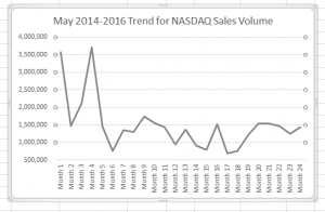
A trendline is a line that represents the general direction in a series of data. Trendlines often are used to represent changes in one set of data over time. Excel can overlay a trendline on certain types of charts, allowing you to compare changes in one set of data with overall trends.
In addition to trendlines, PivotTable reports and PivotChart reports provide methods to manipulate and visualize data. A PivotTable report is a workbook table designed to create meaningful data summaries that analyze worksheets containing large amounts of data. As an interactive view of worksheet data, a PivotTable report lets users summarize data by selecting and grouping categories. When using a PivotTable report, you can change, or pivot, selected categories quickly without needing to manipulate the worksheet itself. You can examine and analyze several complex arrangements of the data and may spot relationships you might not otherwise see. For example, you can look at years of experience for each employee, broken down by type of accounting service, and then look at the yearly revenue for certain subgroupings without having to reorganize your worksheet. A PivotChart report is an Excel feature that lets you summarize worksheet data in the form of a chart, and rearrange parts of the chart structure to explore new data relationships. Also called simply Pivot Charts, these reports are visual representations of PivotTables.
For example, if a company wanted to view a pie chart showing percentages of total revenue for each service type, a PivotChart could show that percentage categorized by city without having to rebuild the chart from scratch for each view. When you create a PivotChart report, Excel creates and associates a PivotTable with that PivotChart. Slicers are graphic objects that you click to filter the data in PivotTables and Pivot Charts. Each slicer button clearly identifies its purpose (the applied filter), making it easy to interpret the data displayed in the PivotTable report.
This chart displays a box and whisker chart. 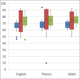
You will create that chart later in this module as you learn about various kinds of statistical and process charts. Using trendlines, PivotTables, Pivot Charts, slicers, and other charts, a user with little knowledge of formulas, functions, and ranges can perform powerful what-if analyses on a set of data. Creating pivot charts requires information that includes the needs, source of data, calculations, and other facts about the worksheet’s development.
Line Charts and Trendlines
A line chart is a chart that displays data as lines across categories. A line chart illustrates the amount of change in data over a period of time, or it may compare multiple items. Some line charts contain data points that usually are plotted in evenly spaced intervals to emphasize the relationships between the points. A 2-D line chart has two axes but can contain multiple lines of data, such as two data series over the same period of time. A 3-D line chart may include a third axis, illustrated by depth, to represent the second data series or even a new category. Using a trendline on certain Excel charts allows you to illustrate the behavior of a set of data to determine if there is a pattern. Trends most often are thought about in terms of how a value changes over time, but trends also can describe the relationship between two variables, such as height and weight. In Excel, you can add a trendline to most types of charts, such as unstacked 2-D area, bar, column, line, inventory, scatter (X, Y), and bubble charts, among others. Chart types that do not examine the relationship between two variables, such as pie and doughnut charts that examine the contribution of different parts to a whole, cannot include trendlines.
When you add a trendline to a chart, you can set the number of periods to forecast forward or backward in time. For example, if you have six years of sales data, you can forecast two periods forward to show the trend for eight years: six years of current data and two years of projected data. You also can display information about the trendline on the chart itself to help guide your analysis. For example, you can display the equation used to calculate the trend and show the R-squared value, which is a number from 0 to 1 that measures the strength of the trend. An R-squared value of 1 means the estimated values in the trendline correspond exactly to the actual data.
More About Pivot Charts
If you need to make a change to the underlying data for a PivotChart, you can click the Change Data button (PivotChart Tools tab | Data group). You also can refresh PivotChart data after the change by clicking the Refresh button (PivotChart Tools tab | Data group).As you have seen, Excel automatically creates a legend when you create a PivotChart. The legend is from the fields in the Values area of the Field List. To move the legend in a PivotChart, right-click the legend and then click Format Legend on the shortcut menu. The Format Legend pane will display options for placing the legend at various locations in the chart area.As with tables and PivotTables, you can filter the data in a Pivot Chart. Any fields in the Axis (Categories) area of the Field List, display as filter buttons in the lower-left corner of the chart area. To filter a PivotChart, click one of the buttons; the resulting menu will allow you to sort, search, and select.Working with SlicersOne of the strengths of PivotTables is that you can ask questions of the data by using filters. Being able to identify and examine subgroups is a useful analytical tool; however, when using filters and autofilters, the user cannot always tell which subgroups have the filters and autofilters selected without clicking filter buttons. Slicers are easy-to-see buttons that you can click to filter the data in PivotTables and PivotCharts, making the data easier to interpret. With slicers, the subgroups are immediately identifiable and can be changed with a click of a button or buttons.
