
38 6.1 Creating PivotTables
Emese Felvegi; Noreen Brown; Barbara Lave; Julie Romey; Mary Schatz; Diane Shingledecker; and Robert McCarn
Learning Objectives
- Understanding the US College Scorecard data sets.
- Interpreting a Data Dictionary.
- Creating a PivotTable.
- Manipulating PivotTable Fields.
- Using Slicers.
This section covers the fundamental skills for setting up and utilizing PivotTables in an Excel spreadsheet. The objective of this chapter is accessing and interpreting data from Department of Education on every college and university in the United States. Critical thinking, interpreting and manipulating data are critical tasks for companies of every size and shape. More specifically, in all jobs today employees are required to manipulate data and make informed decisions, the skills practices in this Chapter are applicable to everyone regardless of career-path.
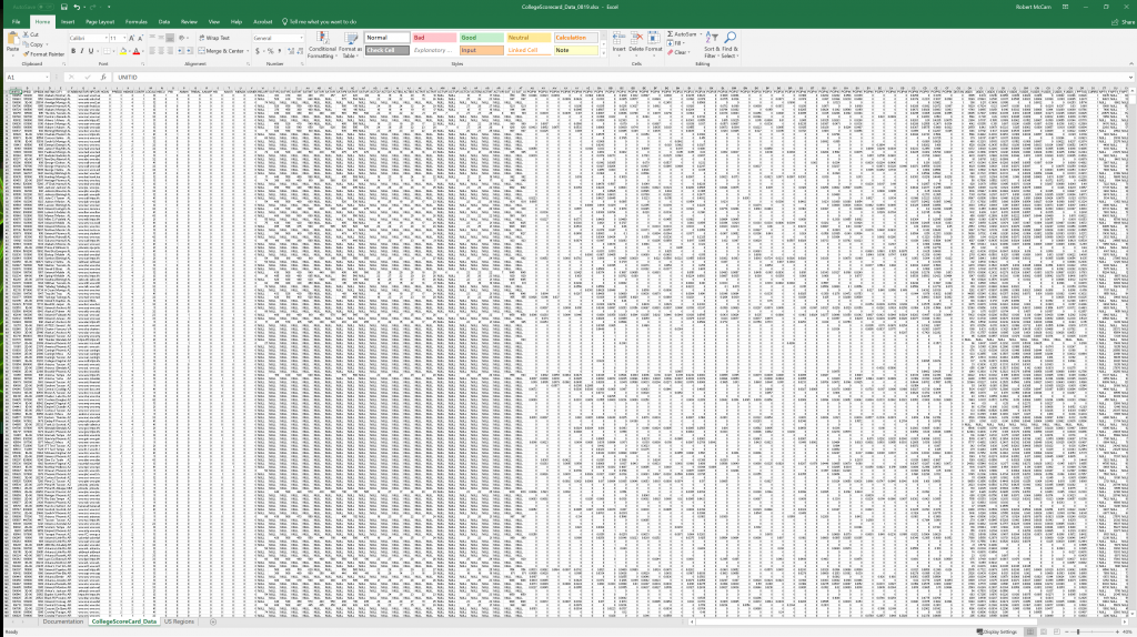
Figure 6.1 shows a zoomed out view of the data that we will be exploring in this chapter. There are (123) columns and (7594) rows in this spreadsheet, totaling to (934,062) individual points of data. With data of this magnitude, it can be difficult to create a table and sort and filter columns to determine a desired piece of information. The scale of the data makes it difficult to interpret it quickly. A PivotTable is a tool in Excel that allows users to visualize, compare and manipulate information quickly and efficiently. In this chapter, we will learn the basics of using this tool to process large amounts of data into useful information
Setting Up Your Environment
While this textbook has explored data from the US Department of Education in the previous chapter practice, the data from the full College Scorecard dataset has not been reviewed in its entirety without edits or filters applied.
Follow these steps to set up your work-space for this file.
- Create a folder in your Documents folder on your PC or Mac. If you have a working folder for other files from this class or textbook, create a separate space/folder for this chapter project.
- Download CollegeScorecard_Data and save to your project folder.
- Download CollegeScorecard_Dictionary and save to your project folder.
- While this file is not *that* big, it is recommended that you close all other windows or applications running on your computer before opening the Data file.
Understanding a Data Dictionary
Open CollegeScorecard_Data.xlsx file.
When you open the College Scorecard Data file for the first time, take time to review the field names (column headings) of each column. For instance, there are terms such as “STABBR”, which combined with the field entries in the column, you could easily surmise that the information in that column represents a U.S. State Abbreviation. You could do this perhaps with column headings such as “INSTNM” or “SAT_AVG”, but it is not the case for all headings. Without looking at the Data Dictionary, what would you suppose that “C150_4_POOLED_SUPP” could mean?
This is the purpose of a Data Dictionary: helping the end-user interpret the meanings of individual fields and column headings in collections of data that are unfamiliar to them. We have provided a Data Dictionary to accompany the College Scorecard data available from the Chapter Downloads text box above. This Data Dictionary is a simplified version of the full Data Dictionary provided by the Department of Education alongside a handbook explaining the process behind the data collection and calculation of the fields. Our Data Dictionary selects fields with the most relevance for inclusion in this chapter to assist us in creating PivotTables.
Open CollegeScorecard_Dictionary.docx
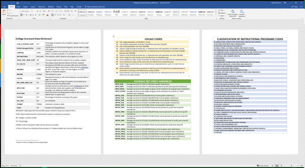
In the first row on the first page, you can see that the data in the column “C150_4_POOLED_SUPP” represents the percentage of students who complete a degree in a four-year institution. There are two things that can be taken from that definition:
- The data will be presented in a particular format, specifically a percentage.
- This data will be dependent on whether the institution this row of data represents is a four-year institution.
Remember, the rows of the College Scorecard represent reporting data from every institution of higher education in the United States, so, some aspects of information in this table will be determinant on other aspects of information; it is up to the end-user how they will consider this. Large data-sets often are not easily interpreted. They might need to be merged, cleaned, or interpreted in a specific way to receive useful information.
Key Takeaways
Types of Data
- BOOLEAN: A data type with two possible values. Unknown values are noted as NULL.
- CODE: Data transformed into a format that is easier to analyze by computers.
- INT: Integer, a whole number.
- PCT: Percentage.
- STRING: A set of characters make out the name of a variable.
Before beginning data interpretation with PivotTables, let’s look at encoded data. In the Data table, look for the “LOCALE” column. Notice that it has repeating information such as “12”, “32”, “41”, etc. This is because, within this column, the data is encoded to represent a more complicated piece of information with a smaller character. So, “12” indicated that the institution represented by this row of data is located in a midsize city (population of at least 100,000 but less than 250,000). Since that idea is too large to be typed into a cell, it is represented by the number 12 and it is left to the end-user to know what that represents.
Creating a PivotTable
If we know what the data in each column represents and we understand how to decipher it, then we can start making conclusions about the data and begin turning it into useful information. But, nearly a million points of data is still a lot to interpret, even if we understand what it represents. PivotTables help us organize and group the information into more manageable chunks. A PivotTable essentially creates a summary function of the data (such as AVERAGE, SUM, MIN, MAX, and COUNT) and allows the end-user to select what view of this data that they wish to see with tools to sort, filter, and analyze these summary functions.
But first, we must create a PivotTable.
Begin with an original, unmanipulated range of data, such as an original copy of CollegeScorecard_Data.xlsx downloaded from the Chapter Downloads textbox above. It may help computer performance if you do NOT turn your data into an Excel table.
- Select any cell in the range of data. (Note: Do NOT select the entire sheet, allow Excel to select the source automatically, otherwise, you may select too much data for the application to handle causing it to slow down or freeze.)
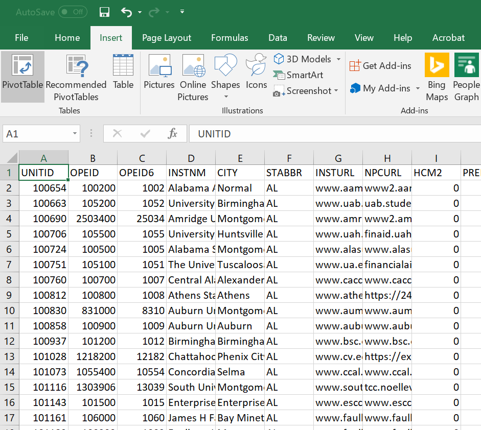
- Go to the Insert tab on the ribbon, select ‘Insert PivotTable’ (Figure 6.3).
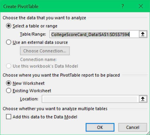
- A window titled ‘Create PivotTable’ will pop-up, the Table/Range automatically populates with a selection of your data table as shown in Figure 6.4.
- Confirm that your PivotTable will be inserted into a New Worksheet.
- Select ‘OK’
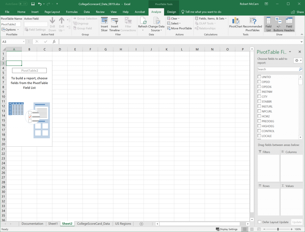
- A new worksheet will be created with an empty PivotTable (Figure 6.5).
Manipulating Pivot Table Fields
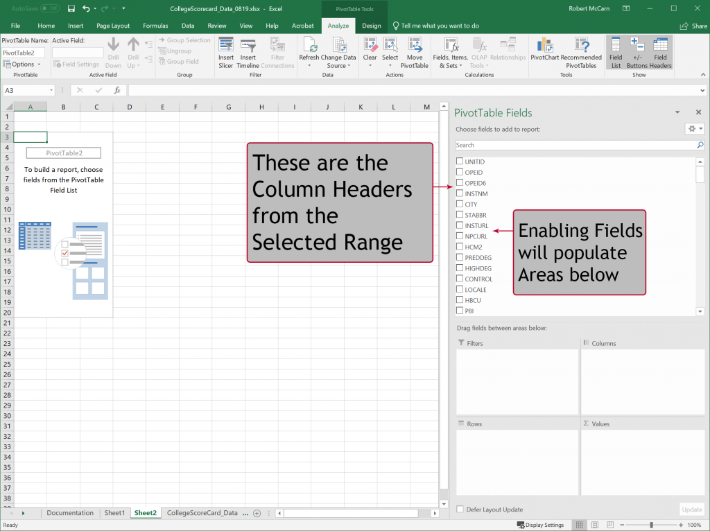
Now that we have created a Pivot Table, we must now tell it what information we would like to see, and how we would like to see it displayed. On the right-hand side of the Excel window, you will see a new pane called “PivotTable Fields”. The PivotTable Fields pane shows a condensed summary view of the column headings from the source table or range of data. Each Field represents one column from that data. You will have to scroll if there are too many field names are in your data or you can use the Search bar to choose fields to add to your report. To get a summary view of the data from the source table, we must select a Field or Fields.
You will notice that there are four Areas below the Field List in which a field can be enabled:
Areas |
Description |
| Rows | Fields enabled in this area will be Row headers going top to bottom of the Pivot Table. Each unique instance of data will be displayed as a Row. |
| Columns | Fields enabled in this area will be Column headers going left to right on the top of the Pivot Table. Each unique instance of data will be displayed as a Column. |
| Filters | Fields enabled in this area will be a top-level filter above the Pivot Table. Selecting one or more values in the filter will show only data that matches that value. |
| Values
|
Fields enabled in this area are summarized as numbers as the result of a function such as SUM, COUNT, MIN, MAX, or AVERAGE
|
There are two ways to enable fields in a PivotTable:
- ENABLING CHECKBOXES: Click on the box beside “STABBR” to automatically populate Rows with the State Abbreviations. Depending on the data values in the column, it will enable the Field in Rows or Values. If you do not like the automatic sorting of your value under Areas labeled Rows, Columns, Filters, or Values, then you can always change the placement of the Field by manually assigning them as described below.
- MANUALLY ASSIGNING FIELDS: Drag (click, hold, and move) “INSTNM” to Values Area to receive a COUNT of the number of institutions, sorted by State. Depending on the data values in the column, Excel will determine a default Summary of the information: Either COUNT, SUM, or AVERAGE. In the next section of this Chapter, we will discuss how to change the Field Value settings.
Exercise
What does this output show?
Which State has the highest count?
Which State the lowest?
Let’s examine this output further using tools in our next chapter!
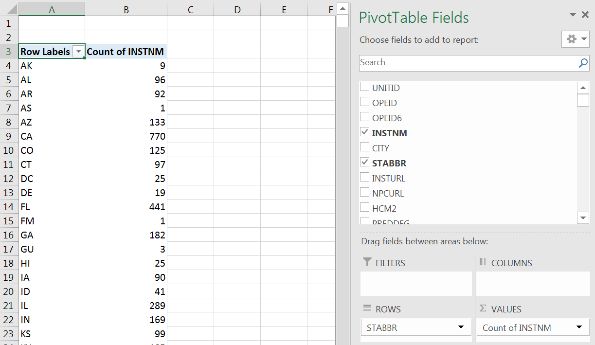
Figure 6.7 PivotTable Output.
Attribution
“6.1 Creating Pivot Tables” by Robert McCarn is licensed under CC BY 4.0
