25 4.6 Scored Assessment
Charting Sales Data
Download Data File: SC4 Data
An effective way to communicate findings in Excel is by graphing data. Graph the attached sales information, visualizing profit margin trends, and production patterns, and the sales pipeline; enabling decision-makers to grasp concepts of current business practices.
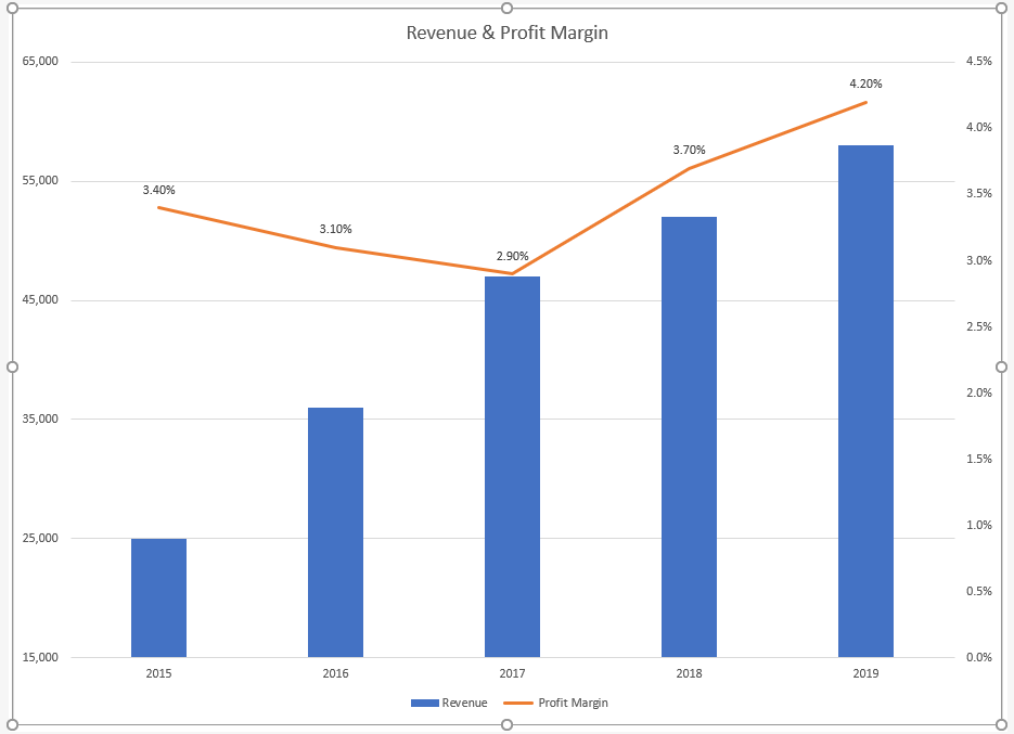
Task 1 Revenue & Profit Margin
Following the directions below create the below charts. Note to match each chart exactly, including the chart styles, and axis bounds.
- Open the file named SC4 Data and then Save As SC4 Sales.
- From the Revenue & Profit Margin sheet, create the below Combination Chart.
- Move the chart to a new sheet. Name the sheet Combo.
- Save your work.
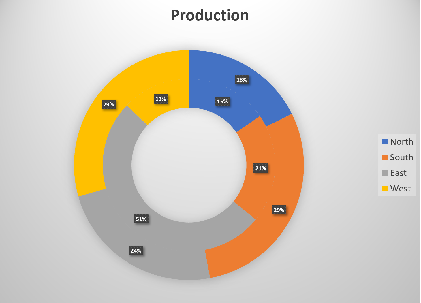
Task 2 Quartly Production Data
Create the below Pie Chart showing how many locations will be producing products in the North, South, East and West Regions.
- From the Products sheet create the below chart.
- Move the chart to a new sheet. Name the sheet Doughnut.
- Save your work.
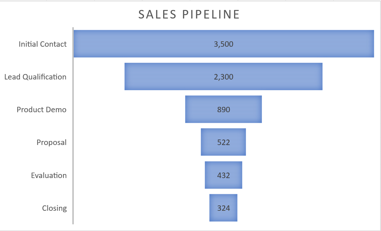
Task 3 Sales Pipeline
Create the below Funnel Chart to provide our sales team a visual snapshot of the company’s sales process, outlining deals that are expected to close within the month.
- From the Sales sheet, create the below Funnel Chart.
- Note to leave the chart embedded in the sheet. Resize, and move the chart accordingly.
- Check the spelling on all of the worksheets and make any necessary changes. Save your work and submit SC4 Sales as directed by your instructor.